Looking back at your preliminary task, what do you feel you have learnt in the procession from in to full product?


Above to the left is my preliminary task and to the right is my finished magazine front cover. You can see straight away from looking at both of them that I have gained skills throughout with project as my final product is an improvement compared to my preliminary task and it much better style and quality.
The difference between the two main images on each front cover is massive. The image on my preliminary task is bad quality so it is not clear and looks unprofessional, furthermore it is also blurry on the hand as she was moving. The image is also quite small and doesn’t dominate the page, which then the image doesn’t stand out and it looks quite bare towards the left of the page. In comparison the image on my finished product dominates the page and is in complete focus which makes the magazine look much more professional. The image on my finished product also follows conventions; there is space down both sides of the image, which means I have room for cover lines. The technology which I used for both images has also changed. For my preliminary task I used my mobile phone, which had a bad quality meanwhile for my finished product I used a good quality camera, this made my finished product look much more professional and it also looked generally nice and more appealing. Another big difference is the cover lines. On my preliminary task, they do not stand out as much on my finished product; this is because the font is not bold enough and the colour of the words, are similar to the colour of the background. By having the cover lines stand out makes a huge difference as the cover lines is what attracts the target audience’s attention. The cover lines on my finished product attract the target audience more as they are about things which interest them. Furthermore for my cover lines on my finished product I made sure that they stand out against the background so they are easy to read but also so it gets the audience’s attention. The background of my finished product is the background in which I used for my background of the images. On my preliminary task, I cut the figure out and put the background as blue. I think on my finished product the background of the image worked well so I decided to keep it, it also added a bit of texture. By having a background which fitted in with the colour scheme, makes it look more professional and neater.
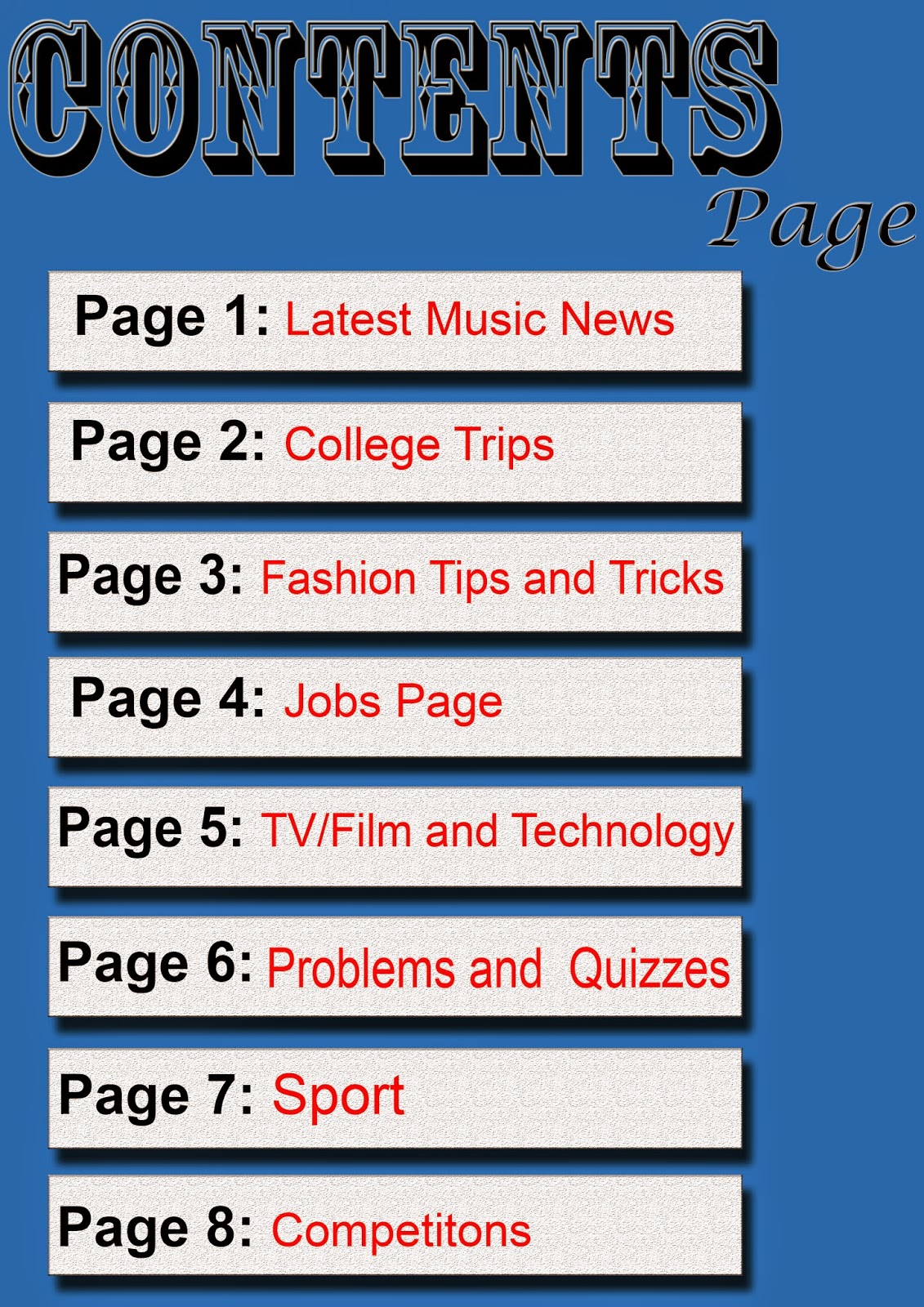

Above to the left is my preliminary task and to the right is my finished magazine contents page. Again, you can see that I have gained skills throughout this project as my final product is an improvement compared to my preliminary task, as it has much better quality.
The first difference between my preliminary task and my finished task is the overall contents. On my preliminary task it is very vague and doesn’t tell you much about what it is in the magazine. Meanwhile in my finished product, there is must more description. This helps the audience know what the magazine includes. My preliminary task also would not appeal to my target audience for my finished product. This is because there are bands and festival mentioned which my target audience would like. On my preliminary task there is not an image on the contents page, this makes it look very plain and boring. Meanwhile on my finished task there are two. By having images on the contents page makes it more exciting and also fills some space as on my preliminary task all there is, is page numbers. The size of this is very big and fills most of the page which makes it look less professional. Furthermore the placing of each page number is not inline, this makes it look unprofessional. The font on my preliminary contents page is not the same size; by this it doesn’t look as neat.
No comments:
Post a Comment